Grow Healthy
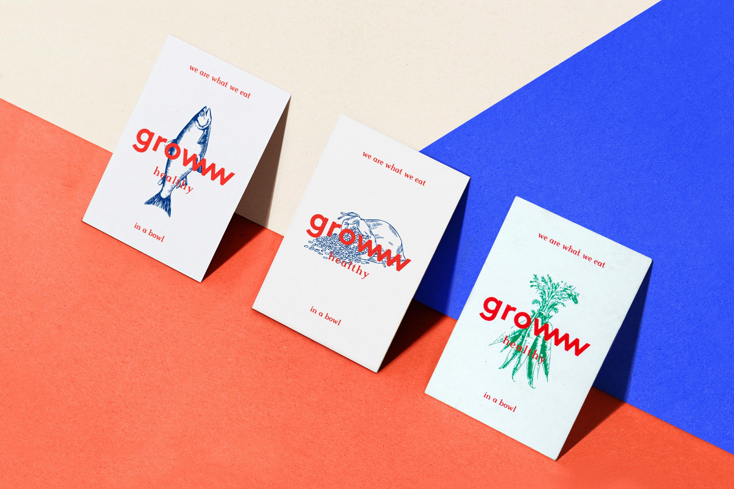
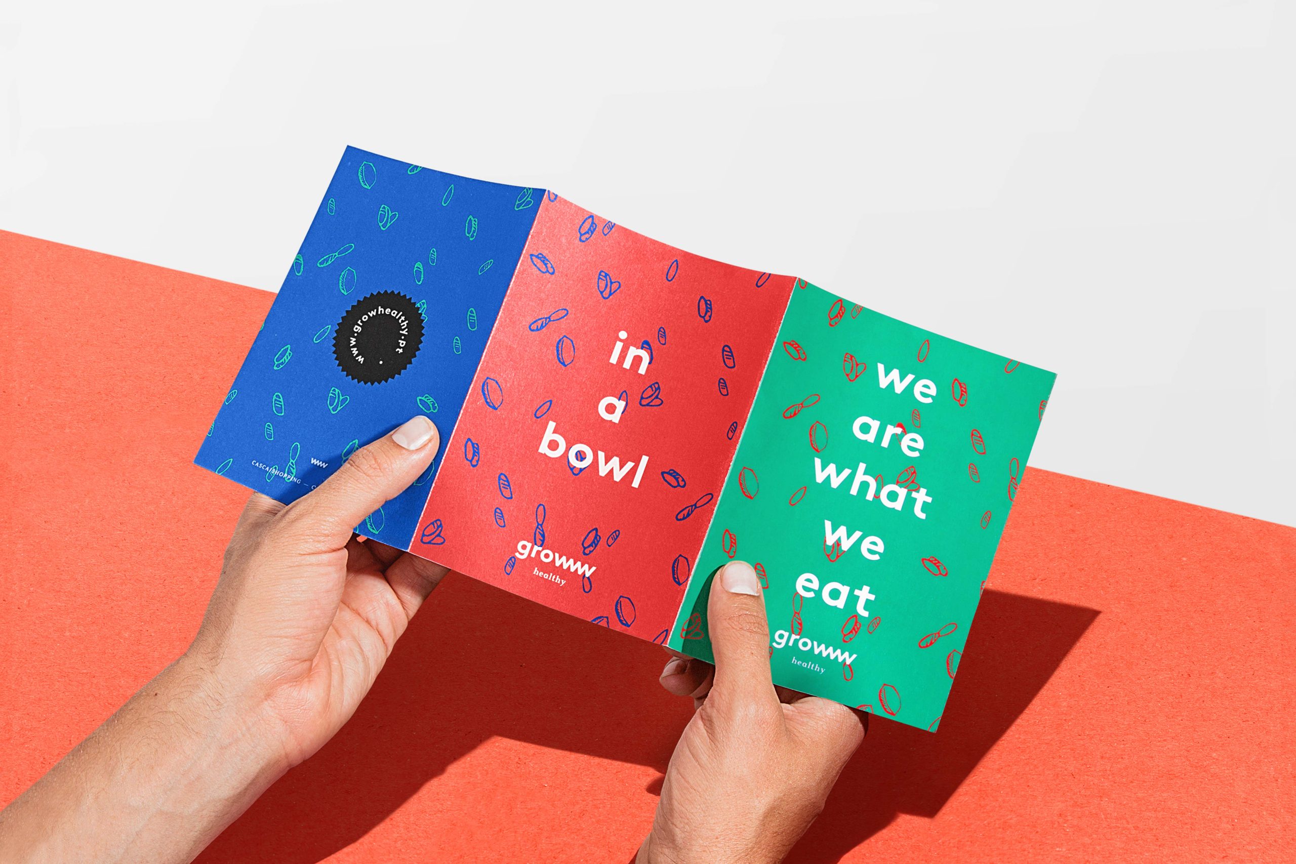
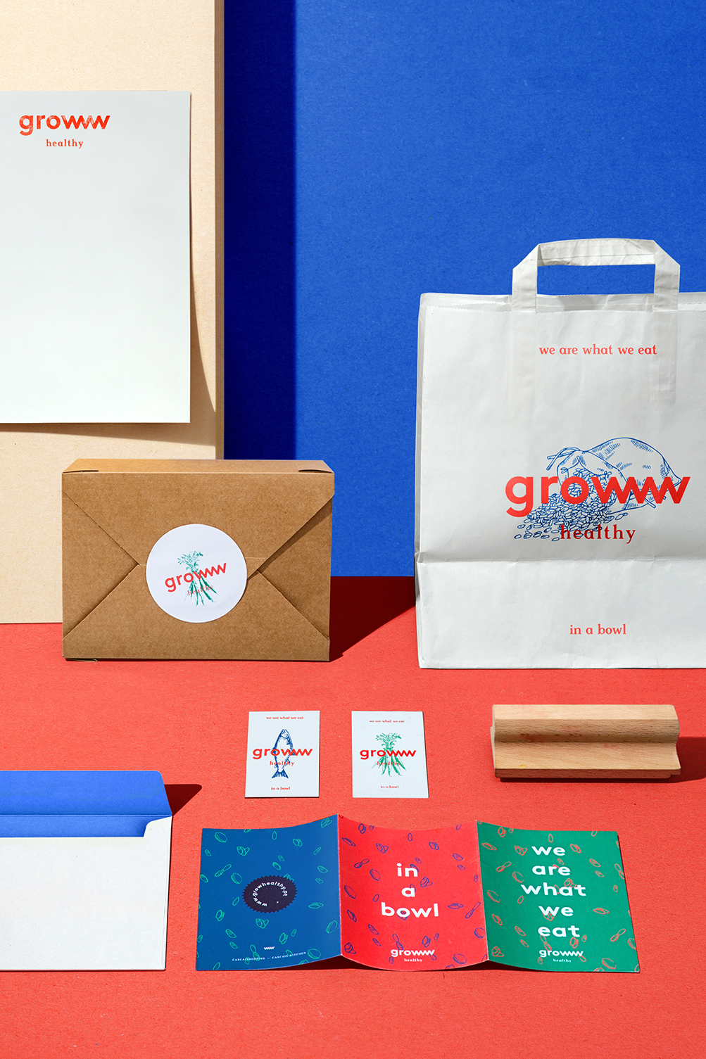
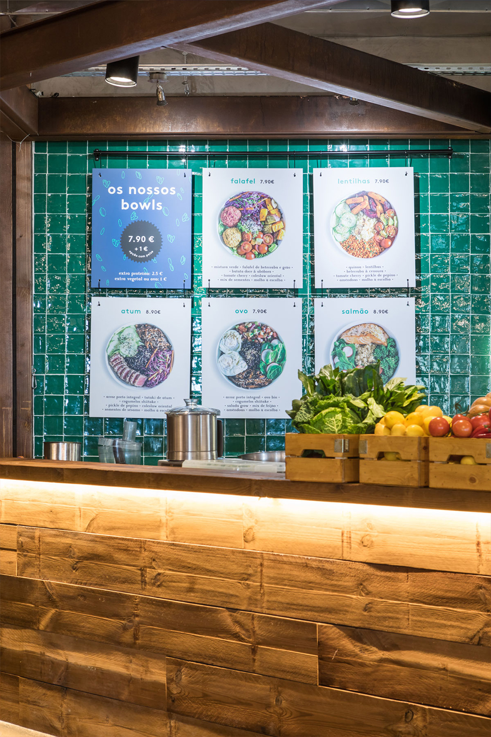
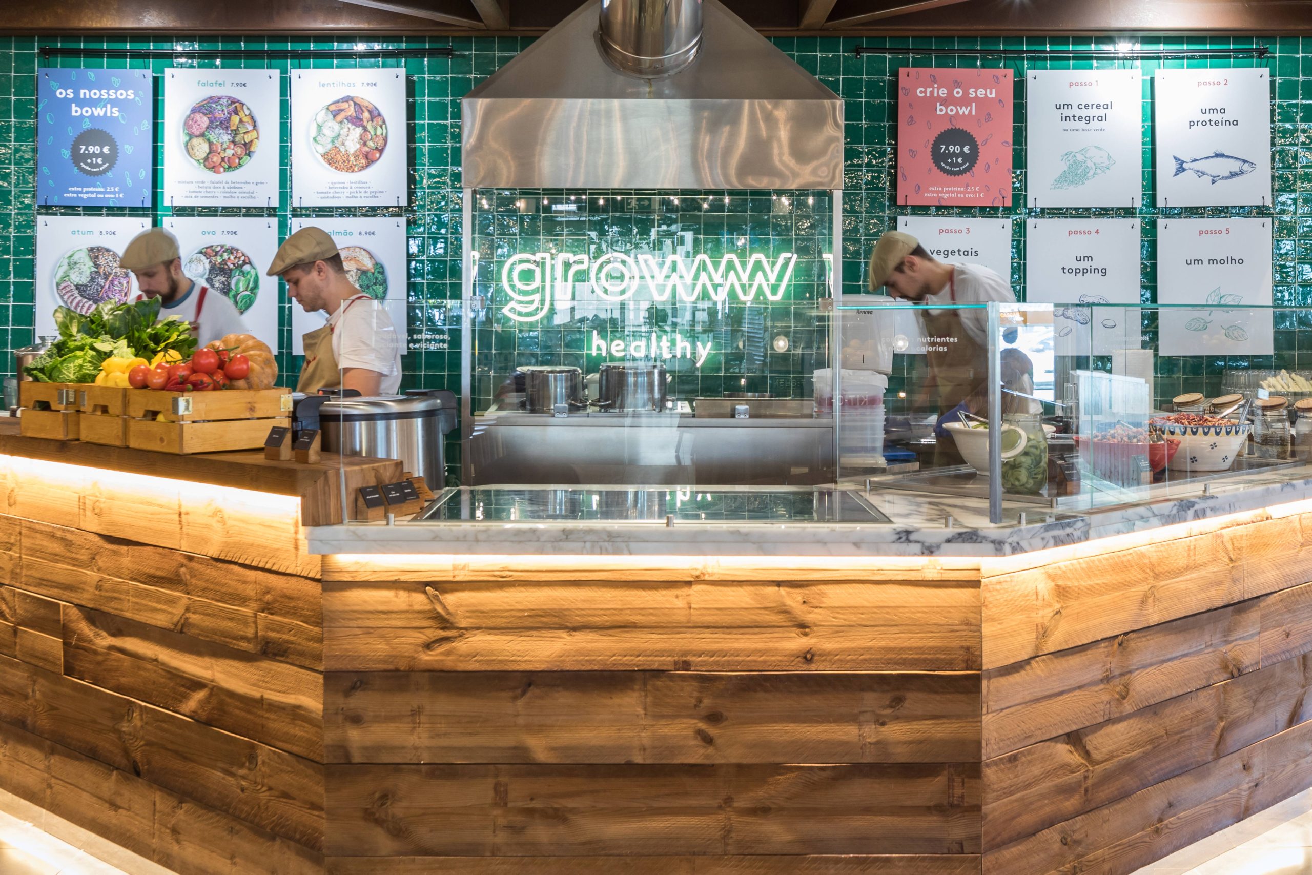
To reflect the meaning of the word Grow, we chose to merge and multiply the letter “W”, in order to create a graphic rhythm suggesting the growth itself. The illustrations give the human and organic feeling to the brand, in contrast with the modern healthy lifestyle. The color system is based on the 3 RGB colors: Green, Blue and Red. Representing the product, and the Cold and Hot Temperatures of how food is served.
Year: 2018
Photo credits: Diogo Alves & Francisco Nogueira