SNPVAC


Founded in 1957, SNPVAC — the National Union of Civil Aviation Flight Personnel — challenged us to rethink its identity through a more versatile and contemporary approach, without losing sight of its roots.
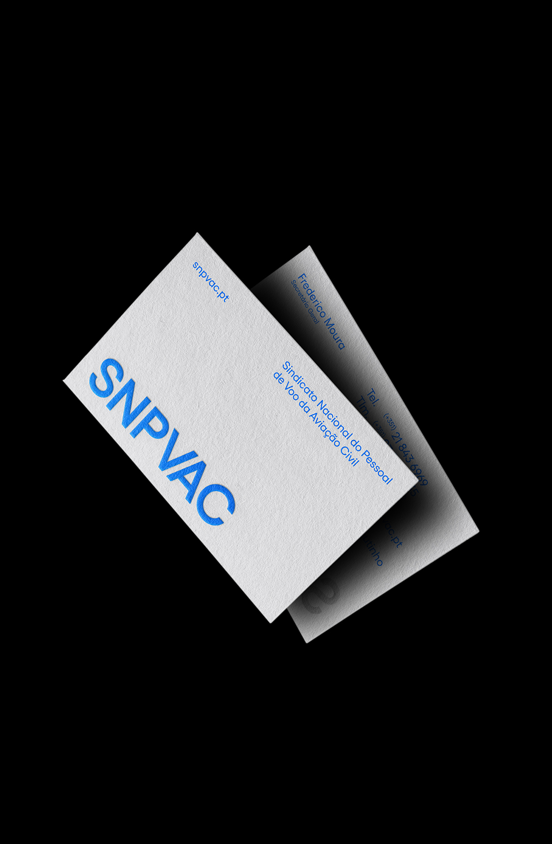
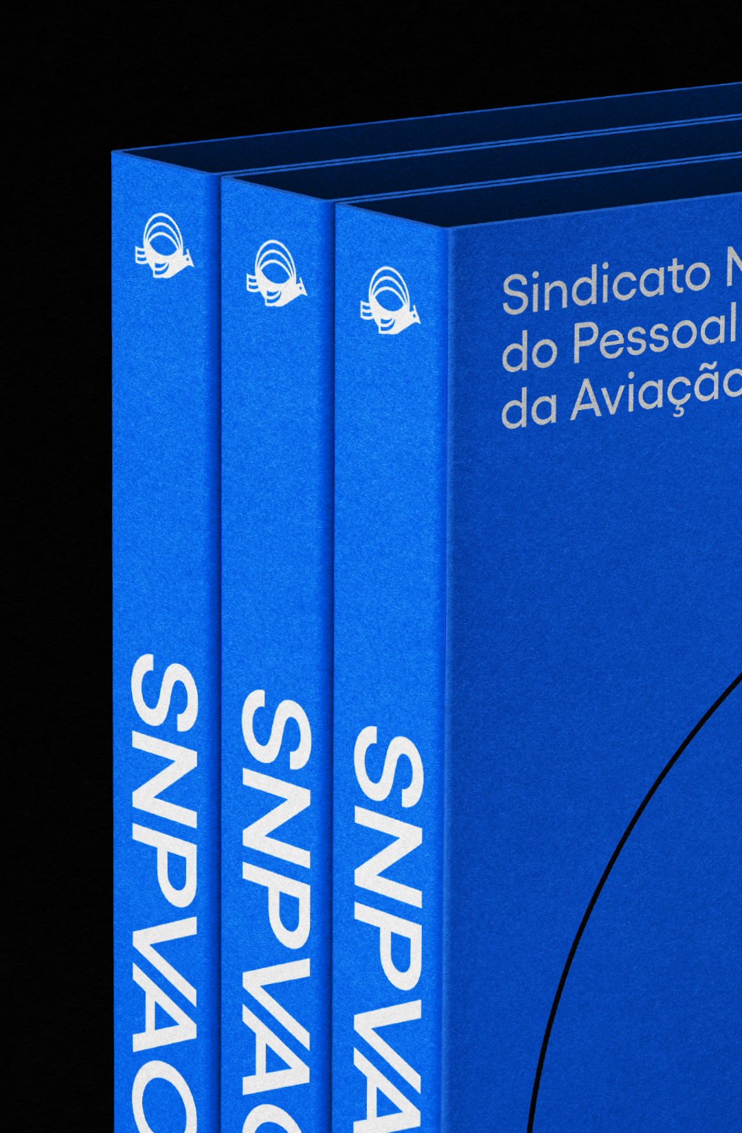
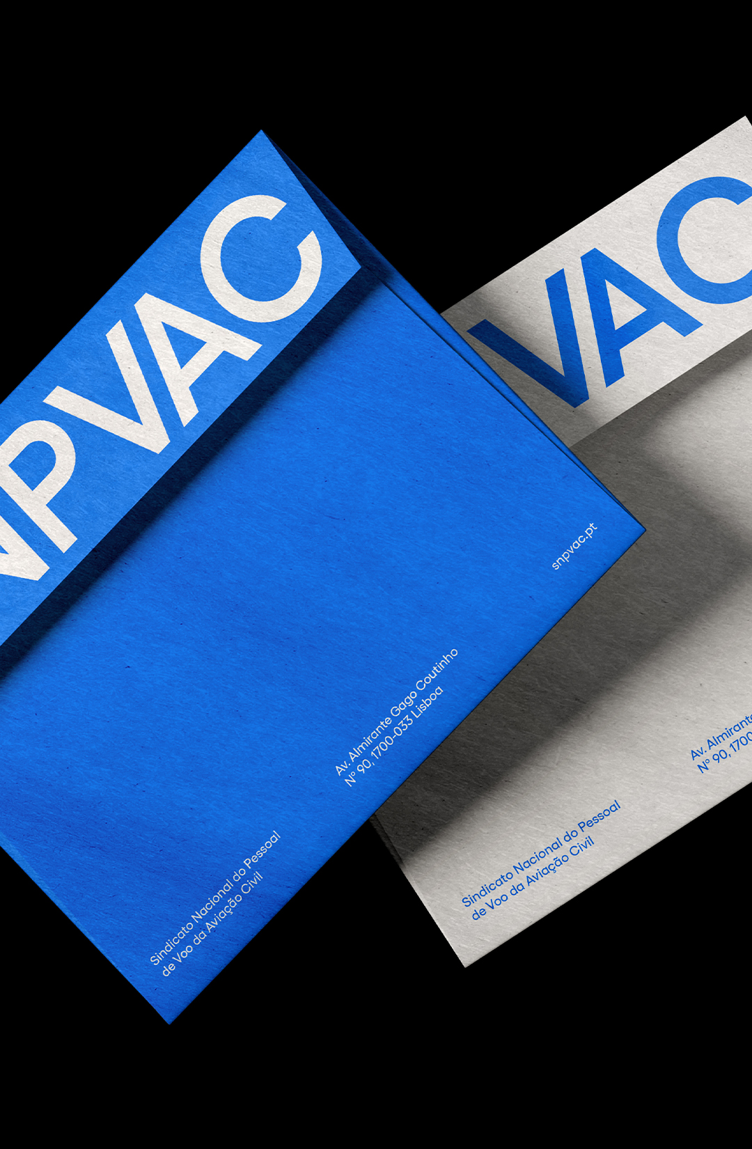
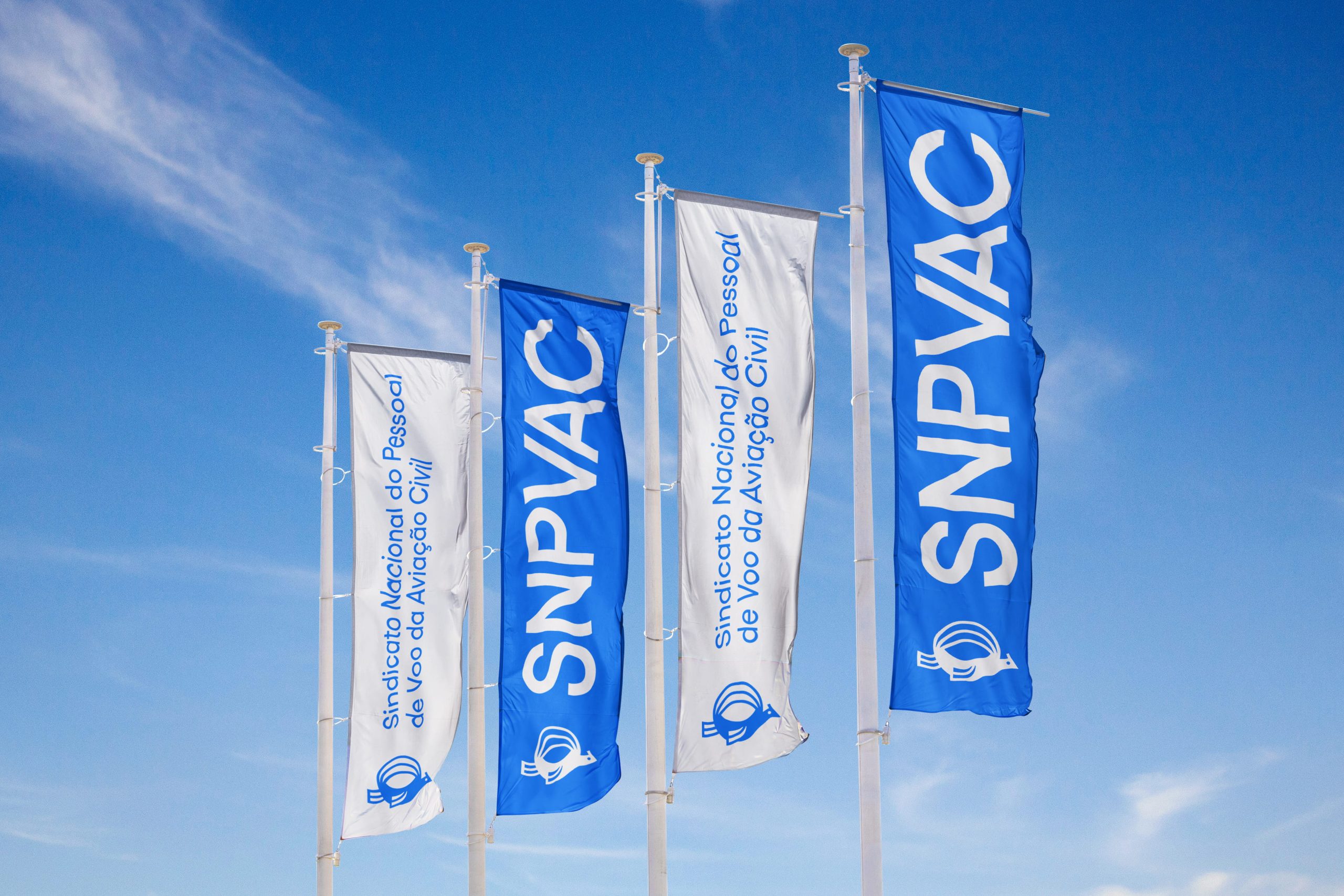
SNPVAC’s rebrand repositions the union for a contemporary era of aviation while honouring its legacy. Inspired by the historic passarola, the bird was redesigned into a modern symbol of representation and trust. A system of graphic arcs, derived from the mark itself, creates movement and continuity across every touchpoint while reinforcing its digital presence. The palette of blue, black and off-white reinforces clarity, trust and relevance — bringing the brand to a new level of visibility and cohesion.
Year: 2020